

Learn how to plan, run, analyze, and repeat a practical website usability test with representative users, realistic tasks, neutral moderation, useful metrics, and an actionable issue backlog.
Quick answer: To run a useful website usability test, choose one clear research question, recruit people who resemble the users you actually serve, give them realistic tasks without telling them how to complete those tasks, watch what they do, ask them to think aloud, record problems consistently, and turn repeated observations into specific design changes. You do not need a sophisticated laboratory to learn something valuable. You do need a disciplined plan that prevents your team from leading participants, collecting vague opinions, or treating one person’s preference as universal evidence.
A website can be technically functional and still be frustrating. A checkout can submit correctly while users fail to find delivery information. A help center can contain the right answer while visitors search with completely different words. A signup flow can pass every automated test while real people hesitate because they do not understand what will happen after they click the button. Usability testing is the practice of watching representative users attempt realistic tasks so you can see where the interface supports them and where it gets in their way.
This guide is designed for small businesses, publishers, nonprofits, product teams, freelancers, and website owners who want a practical testing method without turning the work into a large research program. It covers planning, recruitment, task writing, moderation, remote and in-person sessions, accessibility, note-taking, metrics, synthesis, prioritization, reporting, and retesting. It also explains what to do when participants behave unexpectedly, when your sample is small, when stakeholders disagree with the findings, and when you need to test a rough prototype rather than a finished site.
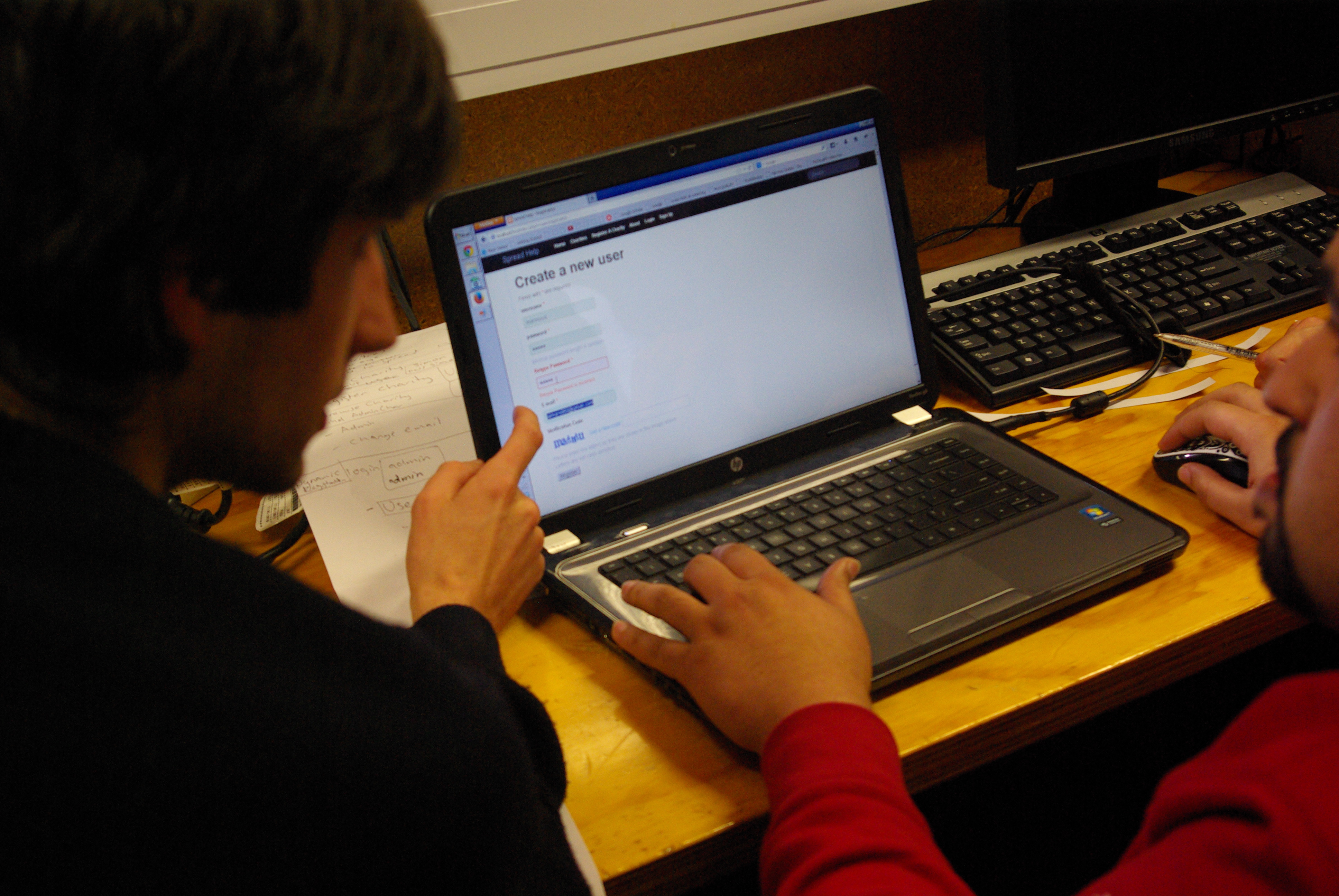 A usability session reveals what people actually do, not only what a team expects them to do. Photo: Samuel Mann, CC BY 2.0, via Wikimedia Commons.
Start with the decision you need to make
The first mistake in usability testing is to begin with a broad goal such as “test the website.” A whole website contains too many journeys, audiences, devices, and questions. The study becomes more useful when the research purpose is linked to a concrete decision. For example, you may need to decide whether a new navigation structure is understandable, whether first-time customers can complete checkout, whether readers can find subscription settings, or whether a redesigned contact form solves a known abandonment problem.
Write the decision in one sentence before you recruit anyone. A useful format is: We need to learn whether [target users] can [important goal] using [part of the product] without [known or suspected barrier]. For example: “We need to learn whether first-time visitors can compare our two service plans and choose the one that matches their needs without relying on support.” That sentence is narrow enough to guide tasks and broad enough to reveal unexpected obstacles.
Then turn the decision into two or three research questions. These should be questions the sessions can realistically answer, such as:
- Can participants locate the comparison information they consider necessary?
- Do they understand the differences between the two plans?
- What, if anything, prevents them from reaching a confident selection?
Avoid writing the questions as predictions you hope to prove. “Users will understand our new pricing cards” invites confirmation bias. “How do users interpret the pricing cards?” gives you permission to discover that the design works, partly works, or fails for reasons you did not predict.
Choose the right thing to test
You do not have to wait for a polished website. Usability testing can be useful on sketches, paper prototypes, clickable mockups, staging sites, live websites, and competing products used as references. The appropriate fidelity depends on the decision you are trying to make.
If you are deciding between two navigation concepts, a rough prototype may be enough. If you need to know whether payment errors are understandable, you probably need an interactive environment that can reproduce those errors. If your question concerns information architecture, the visual design can be unfinished. If your question concerns trust at checkout, realistic content, branding, price presentation, and security cues may matter.
Testing too late is expensive because the team may already be emotionally and technically committed to a solution. Testing too early can also mislead when the prototype omits information that people genuinely need. Match the test artifact to the behavior you want to observe. A blank placeholder cannot tell you whether real copy is understandable, and a static screenshot cannot tell you whether an interaction is discoverable after several steps.
 Early concepts can be tested before development is complete. Photo: d_jan, CC BY 2.0, via Wikimedia Commons.
Define who the test is actually for
“Anyone who uses websites” is rarely a useful participant definition. The people you recruit should resemble the users whose behavior matters to the decision. That does not mean they need to match an elaborate demographic persona. It means they should have the relevant goals, context, knowledge, limitations, or experience level.
Suppose you are testing a website for independent contractors choosing bookkeeping software. A participant who has never invoiced a client may interpret the pricing page very differently from someone who sends twenty invoices a month. If the website is primarily for parents booking pediatric appointments, testing only with your coworkers may hide scheduling, terminology, and mobile-use problems. If the product serves both beginners and experts, you may need participants from both groups rather than averaging them into an imaginary “typical user.”
Create a short screener with inclusion criteria that relate directly to the task. Useful criteria can include whether the person has performed the relevant activity recently, which devices they normally use, their familiarity with a category, whether they make the purchase decision themselves, and whether they use assistive technology. Exclude people whose professional knowledge would make the task unrealistically easy unless experts are part of the target audience.
Do not over-filter. A screener with fifteen demographic requirements can produce a tiny, artificial sample and slow recruitment unnecessarily. Ask only for characteristics that could plausibly change how someone performs the tasks.
Decide how many participants you need
Small formative usability tests are often valuable because their purpose is not to estimate a population percentage with statistical precision. Their purpose is to reveal concrete interaction problems you can investigate and fix. Digital.gov’s plain-language usability guidance notes that a small round can use roughly three to five people who match the intended audience, while its broader testing guidance emphasizes using enough relevant participants to see patterns rather than treating one session as conclusive.
That does not mean five is a universal magic number. The appropriate sample depends on how diverse the audience is, how many distinct journeys you are testing, how severe the decision is, and whether you need qualitative discovery or quantitative estimates. Five participants from one audience segment cannot tell you how a completely different segment behaves. If you need defensible completion rates across multiple populations, you will need a more formal study design and a larger sample.
For a small team, a practical approach is iterative rounds. Test a focused flow with a handful of representative people, fix the major problems, then test again. The second round answers a more valuable question than simply adding many more people to a broken first version: did the changes solve the original barriers without creating new ones?
Recruit participants without contaminating the study
Recruitment influences the quality of every observation that follows. Start with places where your real audience already exists: customer lists where consent and privacy rules allow outreach, newsletter subscribers, community groups, professional associations, user panels, social media audiences, or research recruitment services. Existing customers are useful when the study concerns experienced users, but they may be poor stand-ins for first-time visitors because they already know your terminology and navigation.
When inviting people, describe the activity honestly without giving away the exact behavior you want to observe. If your test is about whether users can discover a returns policy, an invitation saying “help us test our new returns page” primes them to look for returns. A broader description such as “help us evaluate an online shopping experience” preserves more natural behavior.
Compensation should be proportionate to the participant’s time, inconvenience, and the difficulty of recruiting the audience. Specialized professionals and people asked to use assistive technology in a particular setup may require different compensation from a general consumer panel. Whatever approach you use, communicate payment timing, session length, recording expectations, and any technical requirements in advance.
Write tasks that sound like real goals, not interface instructions
The quality of the task script determines whether you observe natural problem solving or merely watch participants follow directions. A bad task tells the user which control to use: “Click Pricing, open Enterprise, and find the annual discount.” A better task describes a situation: “Imagine your team has grown to 25 people and you are deciding whether annual billing is worth considering. Find the information you would need to decide.”
Good tasks have a believable motivation, a clear end state, and no hidden answer embedded in the wording. They should use the participant’s language rather than your interface labels whenever possible. If the navigation item says “Resource Center,” do not tell the participant to “use the Resource Center.” Ask them to find a setup tutorial and see whether they discover that section themselves.
For each task, document five things privately for the research team:
- Purpose: what research question the task addresses.
- Starting point: where the participant begins.
- Success condition: what counts as completion.
- Critical path: the intended route, used for comparison rather than as a script.
- Known alternatives: other legitimate ways a participant might succeed.
Do not define success so narrowly that an unexpected but valid route is counted as failure. If someone uses site search instead of navigation and reaches the correct answer efficiently, that behavior may reveal a strength in search rather than a failure in information architecture.
Order tasks to reduce learning effects
The first task teaches participants something about the interface, so task order matters. If task one forces them through account settings, task four no longer measures whether account settings are naturally discoverable. Put important discovery tasks early, before participants learn the site’s structure from your other scenarios.
When possible, vary task order across participants if later tasks could be strongly influenced by earlier ones. For a very small practical study, full experimental counterbalancing may be unnecessary, but you should at least recognize the learning effect in your interpretation.
Begin with a task that is meaningful but not emotionally or technically overwhelming. A participant who immediately feels they have “failed the test” may become quiet and cautious for the rest of the session. Remember that the interface is being tested, not the person. Your introduction should make that explicit.
Build a moderator guide before the first session
A moderator guide keeps sessions comparable while still allowing natural follow-up. It should include the introduction, consent and recording confirmation, warm-up questions, task scenarios, neutral prompts, post-task questions, and wrap-up. The guide is not a script you must read mechanically; it is a guardrail against improvising leading questions when the session becomes interesting.
Useful neutral prompts include “What are you thinking now?”, “What were you expecting to happen?”, “Tell me what you are looking for,” and “What does that wording mean to you?” If a participant asks, “Should I click this?” avoid answering unless safety or test integrity requires intervention. You can respond, “What would you do if I were not here?”
Leading prompts destroy evidence. “Did you notice the blue button?” teaches the participant where to look. “Was that easy?” pushes them toward a positive judgment. “Would a filter help?” introduces a solution from the research team. Instead ask, “How would you describe that experience?” or “What would you expect to be able to do here?”
Run a pilot before using real sessions as evidence
A pilot is a rehearsal with someone who is not part of your final sample. It catches broken links, unclear tasks, prototype dead ends, timing problems, recording failures, and moderator wording that accidentally reveals the answer. A twenty-minute pilot can save hours of unusable research.
During the pilot, time each task and note where the moderator needs to explain something that participants should be able to understand from the study materials. If the tester cannot tell when a task is complete, your success criteria probably need refinement. If the prototype does not support an obvious alternative path, decide whether to build that path or explicitly constrain the scenario.
After the pilot, revise the guide. Do not keep confusing wording merely because you want every session to be “identical.” Consistency matters after the study begins; quality matters before it begins.
Prepare the environment so the technology disappears
For in-person testing, use a quiet room, a device that reflects the participant’s normal context when possible, a reliable network, and a way for observers to watch without crowding the participant. For remote testing, verify the meeting link, screen-sharing permissions, audio, recording storage, prototype access, browser requirements, and backup communication channel.
Ask participants to close private windows and notifications before sharing their screen. If the session may involve logging in, avoid requesting real passwords or personal account data unless the study has a carefully designed secure process. Prefer test accounts and fictional data. If payment information is irrelevant to the research question, do not collect it.
Prepare a backup plan. A prototype can fail, a video platform can refuse screen sharing, and a participant’s connection can drop. Keep a second meeting link, screenshots of critical states, or a locally accessible version when feasible. Technical failure should not pressure the participant into exposing personal information or installing unfamiliar software.
 Remote tests depend on clear communication, screen visibility, and reliable observation. Diagram: Markku Myllylahti, public domain, via Wikimedia Commons.
Begin every session by reducing performance anxiety
Participants frequently believe they are being tested even when you say otherwise. Reduce that pressure explicitly. Explain that you are testing the website, that there are no right answers, and that confusion is useful information because it shows the team what to improve. Tell them they may stop or take a break at any time according to your study terms.
Confirm whether recording is permitted before you start recording. Explain who may see the recording, how long it will be stored, and how it will be used according to your privacy process. Consent is not a decorative checkbox. If your organization has formal research, legal, or privacy requirements, follow them rather than copying a generic consent template from another context.
Use a few warm-up questions to understand relevant experience. Ask about the activity, not about opinions of your design. For example, “When did you last compare software plans?” can reveal whether the participant is an experienced buyer. Avoid spending ten minutes on biographical questions that do not affect the research.
Teach think-aloud without turning it into an interview
Think-aloud means encouraging participants to verbalize what they notice, expect, and decide while they work. It gives context to behavior. A click alone tells you where someone went; their words may tell you that they clicked only because every other option looked worse.
Some people naturally narrate. Others become silent when concentrating. When silence lasts long enough that you lose context, use a light prompt such as “What are you thinking?” Do not demand constant commentary, because over-prompting can change the behavior you are trying to observe.
Pay attention when actions and words disagree. A participant may say a page is “fine” while rereading the same paragraph three times. They may describe checkout as “easy” after taking several wrong turns. Behavioral evidence and verbal evidence answer different questions; neither automatically cancels the other.
Observe before you rescue
The hardest moderation skill is allowing a participant to struggle long enough to learn from the struggle. Teams naturally want to help. Designers especially know exactly where the button is and may feel uncomfortable watching someone miss it. But the moment you point, explain, or defend, you stop testing the interface and start testing the interface plus your assistance.
Define intervention rules before the study. You might allow a participant to continue until they explicitly give up, exceed a time threshold, reach a dangerous or irreversible action, or become distressed. When you intervene, record that the task required assistance. Do not silently count an assisted completion as independent success.
If the participant gets stuck because the prototype itself is incomplete rather than because the design is confusing, explain the limitation briefly and move them to the next valid state. Distinguish prototype limitations from usability findings in your notes so developers are not asked to “fix” behavior the prototype never implemented.
Separate observation from interpretation in your notes
Write what happened before writing what you think it means. “Participant opened FAQ, returned to pricing, opened FAQ again, then said ‘I still don’t know whether setup is included’” is an observation. “Pricing page is confusing” is an interpretation. Both are useful, but mixing them too early makes synthesis harder and encourages confirmation bias.
A simple note structure can include participant code, task number, timestamp, behavior, quote, apparent outcome, and tentative issue tag. Use participant codes rather than names in working notes whenever practical. If several observers are present, give them the same template so you can compare observations later.
Observers should not interrupt the session. Digital.gov recommends separating moderation and observation roles when a team is present, with observers contributing to an issues log and relaying necessary questions to the moderator rather than speaking over the participant. This protects the participant from feeling surrounded by people evaluating them.
Capture task outcomes consistently
Qualitative insight is the heart of many small usability tests, but simple structured outcomes help you compare sessions. For each task, record whether the participant completed it independently, completed it with assistance, partially completed it, failed, or abandoned it. Define these categories before analysis.
You may also record time on task, major errors, wrong turns, search attempts, repeated backtracking, and post-task confidence. Use these metrics carefully. A slow task is not automatically bad if the task is inherently thoughtful, such as comparing insurance options. A fast task is not automatically good if the participant rushed to the wrong interpretation.
Do not report percentages from a tiny formative sample as though they represent the entire audience. Saying “4 of 5 participants did not notice the account recovery link” accurately describes what you observed. Saying “80% of users cannot recover their account” implies population-level precision your study does not support.
Pay special attention to expectation failures
Some of the most valuable moments occur when a participant confidently predicts what will happen and the interface does something else. Record the expectation in their own words. Examples include expecting a logo to return to the homepage, expecting “Save” to close a form, expecting a price to include tax, or expecting search filters to remain after viewing a result.
An expectation failure can be more important than a visible error because it damages the user’s mental model. The participant may still finish the task but carry a misunderstanding into later steps. When you see repeated expectation failures, ask whether the design is violating a common convention, using ambiguous language, or hiding system status.
Do not turn the session into a design review
Participants are excellent sources of evidence about their goals, reactions, problems, language, and behavior. They are not automatically responsible for designing the solution. If someone says, “You should make this button green,” the useful evidence may be that the current primary action was hard to identify. The color suggestion is one possible solution, not the finding itself.
When participants propose features, ask what problem the feature would solve. “What would that allow you to do?” often uncovers the underlying need. This prevents a research report from becoming a list of conflicting feature requests.
Include mobile conditions when mobile behavior matters
A desktop-only study can miss problems that dominate real usage. Mobile users deal with smaller screens, virtual keyboards, intermittent connections, touch targets, permission prompts, orientation changes, and interruptions. If analytics show meaningful mobile traffic or the service is commonly used away from a desk, test on mobile devices rather than merely shrinking a desktop browser.
Let participants use their own device when privacy and technical logistics make that appropriate, because familiar keyboards, accessibility settings, browsers, and password managers affect behavior. Alternatively, provide standardized devices when you need controlled conditions. Document which approach you used so readers understand the context of the findings.
Include disabled users instead of treating accessibility as a separate universe
Automated accessibility checks and standards conformance reviews are important, but they do not replace evaluation with people. W3C’s Web Accessibility Initiative explains that involving disabled users can reveal real-world barriers that conformance checks alone may not uncover. At the same time, testing with a few disabled participants cannot prove that a website is accessible to everyone or replace a WCAG evaluation.
Recruit according to the audience and research question. Consider different disabilities, experience levels, assistive technologies, input methods, magnification, screen readers, voice control, keyboard-only navigation, and cognitive needs where relevant. Do not assume that one participant represents everyone with the same disability.
Prepare the environment around the participant rather than forcing them into your preferred setup. Confirm whether their assistive technology can work with the prototype. A highly visual clickable mockup may be impossible for a screen reader to interpret even if the intended final product will be accessible. If the artifact prevents meaningful testing, change the artifact.
When reporting accessibility-related findings, distinguish among a general usability issue, a likely accessibility barrier, an assistive-technology compatibility issue, and a standards-conformance question that requires separate technical review.
Test content comprehension, not only clicks
A participant reaching the correct page does not prove they understood it. For content-heavy websites, add comprehension checks after the participant finds information. Ask them to explain the answer in their own words rather than repeating a heading. This is especially important for eligibility rules, service limitations, fees, instructions, privacy choices, and policies.
A useful neutral question is, “Based on what you found, what would you do next?” If the participant reaches the cancellation page but believes cancellation takes effect immediately when the page actually says end of billing period, the navigation succeeded and the content failed.
Digital.gov’s plain-language guidance specifically frames usability testing as a way to test content as a whole when people must find information in order to understand it. That distinction is useful: findability and comprehension are connected but not identical.
Know when remote testing is the better choice
Remote moderated testing can recruit people from a wider geographic area, let participants use familiar equipment, and reduce travel. It is often ideal for websites and web apps. In-person testing can be better when physical context, hardware, complex observation, or unreliable remote technology would interfere with the research.
Remote testing has its own artifacts. Screen sharing can slow performance. Participants may behave differently when they know their screen is recorded. Browser extensions, display scaling, and notification settings can influence what you observe. Treat those conditions as context rather than pretending the remote environment is invisible.
Unmoderated remote testing can scale more easily, but you lose the ability to clarify what a participant means in the moment. It works best when tasks and success conditions are unambiguous and when the prototype is robust enough to handle unexpected paths. For exploratory problems where you need to understand hesitation and mental models, moderated sessions often provide richer evidence.
Debrief immediately after each session
Memory decays quickly, and teams often remember dramatic moments more clearly than repeated subtle problems. Spend five to ten minutes after each session capturing the top observations while they are fresh. Ask observers: What surprised us? Where did the participant struggle? What worked unusually well? What do we want to watch for in the next session?
Do not redesign the test after every participant simply because one behavior surprised you. If the task is valid, keep enough consistency to see whether the pattern repeats. You can add a neutral follow-up question for later sessions if it does not change the core task.
Maintain a rolling issues log, but label early issues as provisional. A single participant’s problem is worth recording, especially if the consequence is severe, but it should not automatically become the team’s highest priority.
Synthesize patterns across sessions
After the round is complete, group observations by problem rather than by participant. For example, several different behaviors may point to the same underlying issue: one person overlooks the shipping estimator, another searches the FAQ for delivery cost, and a third adds an item to the cart just to reveal shipping. The pattern may be inadequate cost visibility, not three unrelated navigation problems.
Create an issue statement that contains four parts:
- Context: where and during which goal the issue occurred.
- Observed behavior: what participants did or misunderstood.
- Impact: how the problem affected task completion, confidence, time, or risk.
- Evidence: which sessions showed the pattern and representative examples.
A strong issue statement might read: “When comparing plans, four of six participants looked for information about cancellation before choosing annual billing. The cancellation condition was available only in the FAQ, so three participants delayed their choice and one selected monthly billing specifically because the annual commitment felt unclear.” That is more actionable than “Users want clearer pricing.”
Separate frequency from severity
A rare issue can be severe. If one participant accidentally deletes important data because the confirmation wording is ambiguous, the consequence may justify immediate attention even if no other participant encounters the path. Conversely, a frequent cosmetic hesitation may be low priority.
Rate severity using factors your team agrees on, such as whether the issue blocks the task, causes an incorrect outcome, creates financial or privacy risk, can be recovered from easily, affects a high-value journey, and is likely to occur often in real use. Keep the scale simple. A four-level system such as critical, high, medium, and low is easier to apply consistently than a complicated mathematical score.
Do not let severity labels become political weapons. The purpose is to make tradeoffs visible, not to prove that research outranks engineering or business constraints.
Prioritize the problem before designing the fix
Teams often jump from an observation directly to a solution: “Three users missed the link, so make it red.” Pause between evidence and design. Ask why the link was missed. Is the label unclear? Is it in the wrong place? Is another element visually competing with it? Do users expect the action somewhere else? Is the action unnecessary because the flow should happen automatically?
Generate more than one solution for high-impact issues, then choose based on constraints and design principles. If possible, prototype the promising options and test again. Iteration is the point. Usability testing is not a courtroom verdict that tells a designer exactly what to build.
Create a report people can actually use
A useful report should make it easy for a product manager, designer, writer, developer, or executive to understand what was tested, what was learned, how confident the team should be, and what happens next. Avoid burying the findings under research jargon.
Include the study purpose, dates, participant profile, devices or environments, tasks, method, limitations, top findings, supporting evidence, severity, and recommended next actions. Use screenshots or short clips when consent and privacy terms allow them. A thirty-second clip of repeated confusion can communicate a problem more effectively than a page of prose, but never share participant recordings beyond the agreed audience.
Make limitations visible. If all participants were existing customers, say so. If the mobile prototype had incomplete search, say so. If only English-language users were tested, do not imply the results represent translated versions. Clear limitations increase credibility rather than weakening the report.
Hold a synthesis meeting instead of simply emailing the report
Research creates more change when the people responsible for the product participate in interpretation. Bring the relevant team together, review the evidence, group issues, agree on severity, and decide which changes enter the backlog. Digital.gov’s current testing guidance recommends collaborative synthesis and ending the discussion with decisions about how the team will use what it learned.
Do not use the meeting to relitigate whether a participant was “wrong.” If users consistently interpret a label differently from the team, that mismatch is the finding. The team may still decide not to change the interface, but it should make that decision with the evidence visible.
Turn findings into testable backlog items
A research report that never reaches implementation is documentation, not improvement. Convert prioritized findings into backlog items with a clear problem statement and acceptance criteria. Keep the evidence attached so future contributors understand why the work exists.
For example, instead of “Improve checkout,” create a narrower item: “Clarify delivery cost before payment: participants should be able to identify whether shipping charges apply before entering payment information.” The design team can then explore solutions without being forced into a specific visual treatment.
Tag items that need content changes, interaction design, engineering, policy clarification, analytics instrumentation, or accessibility review. Some apparent usability problems are symptoms of business rules rather than interface design. The right owner matters.
Retest the changed experience
Do not assume the fix works because it looks clearer to the team. A revised label can solve one misunderstanding and create another. A modal that makes an action more visible can interrupt users who did not need it. Retesting closes the loop.
Use the same core research question and comparable tasks when you need to judge whether the issue improved. Recruit new participants when possible so prior familiarity does not make the revised design seem easier than it is. Compare patterns rather than claiming mathematical significance from a tiny sample.
Keep a record of what changed between rounds. Over time, this becomes a useful research history: which problems were observed, which fixes were attempted, which fixes worked, and which assumptions returned in later redesigns.
Use analytics and usability testing together
Analytics can tell you where many people drop off, which pages receive search traffic, what devices are common, or how often a feature is used. They usually cannot tell you why a person hesitated, misunderstood a label, or abandoned a task. Usability testing can reveal those mechanisms but cannot tell you how common they are across millions of sessions.
Use each method for what it does well. Analytics can identify a high-abandonment step worth testing. Usability sessions can generate hypotheses about the abandonment. A redesigned flow can then be monitored with analytics or, where appropriate, an experiment to see whether behavior improves at scale.
Do not cherry-pick whichever data source supports the preferred solution. If qualitative sessions suggest confusion but conversion remains strong, investigate whether the confusion affects only a segment, occurs in a low-value path, or is compensated for elsewhere in the experience.
Avoid the most common moderation mistakes
Explaining the interface: If you tell participants why a feature works a certain way, you remove the chance to see whether the interface communicates that on its own.
Defending the design: “We had to do that because…” may be true, but it turns research into a debate. Record the constraint for later.
Asking leading questions: Replace “Wouldn’t this be clearer if…” with “How would you expect this to work?”
Talking through silence: A few quiet seconds can reveal where someone is reading, scanning, or deciding.
Testing your memory instead of the product: Use the guide and task sheet. Do not improvise different tasks for each person unless the study is explicitly exploratory.
Ignoring successful moments: Record what works. Preserving effective patterns is as important as finding defects.
Avoid the most common analysis mistakes
Counting every comment as a vote: Participants may suggest incompatible features. Look for underlying needs and observed behavior.
Generalizing from one person: One severe problem may matter, but one preference is not “what users want.”
Confusing frequency with importance: High-impact rare failures can outrank frequent mild friction.
Reporting symptoms instead of causes: “User clicked Back” is not the issue. Ask what expectation or information gap produced the behavior.
Discarding outliers automatically: An outlier may reveal a real segment, accessibility need, edge case, or high-risk path.
Claiming accessibility from user testing alone: W3C explicitly recommends combining user evaluation with standards-based evaluation rather than treating either one as sufficient by itself.
What to do when participants contradict one another
Contradiction is normal because users have different experience, goals, vocabulary, and expectations. Do not average opposite opinions into a meaningless middle. Segment the evidence. Perhaps experienced users prefer dense controls while beginners need guidance. Perhaps mobile participants want a different interaction from desktop users.
Return to the product’s audience and purpose. Which segment is primary for this decision? Can the design support both without compromise? Is the disagreement about preference or task success? Two participants can prefer different layouts while both complete the task equally well.
If the disagreement affects an important decision and your sample is too small to interpret confidently, that is a reason for another focused round, not a reason to invent certainty.
What to do when everyone succeeds but the experience still feels weak
Task completion is only one dimension of usability. Participants can complete a flow while feeling uncertain, taking unnecessary detours, rereading instructions, or relying on trial and error. Review efficiency, confidence, errors, expectations, and comments as well as final success.
Ask whether the task was too easy or whether your wording accidentally pointed to the answer. Check whether participants were already familiar with the website. Compare behavior with analytics or support tickets. If real customers repeatedly ask a question that every test participant answered instantly, your test setup may not represent the real context.
What to do when the stakeholder says the sample is too small
The stakeholder may be correct if you are making population estimates. Be precise about what the study can and cannot support. A small qualitative test can demonstrate that specific people encountered specific barriers and reveal mechanisms worth fixing or investigating. It cannot reliably estimate how many users in the entire market experience those barriers.
Frame the evidence appropriately. Show repeated observations, task context, and consequences. Pair them with analytics, support logs, search queries, customer feedback, or larger quantitative research when the business decision requires prevalence estimates.
Never use the small-sample nature of formative research as an excuse to ignore an obvious critical failure, such as a participant being unable to cancel, understand a charge, use keyboard navigation, or recover from a destructive action.
Build a lightweight testing kit your team can reuse
A repeatable kit reduces the friction of future studies without forcing every study into the same template. Keep a research-plan outline, screener template, consent process, moderator guide, note sheet, task-outcome definitions, severity scale, report structure, recording checklist, and retrospective notes about what worked.
Also maintain a research repository with appropriate access controls. Tag findings by journey, audience, date, device, and product area. This prevents teams from repeating the same study because previous evidence cannot be found. It also helps identify recurring problems across redesigns.
The kit should standardize process, not conclusions. Every new study still needs its own research question, participant criteria, tasks, and interpretation.
A practical one-week usability testing schedule
Day 1 — Define the question. Choose one flow, write the decision, identify participant criteria, and draft three to five tasks.
Day 2 — Prepare. Build or stabilize the prototype, write the moderator guide, set success conditions, prepare consent and recording logistics, and recruit participants.
Day 3 — Pilot and revise. Run one internal pilot with someone outside the product team. Fix broken tasks and confusing instructions.
Day 4 — Run the first sessions. Conduct two or three sessions, debrief after each, and maintain a provisional issues log without redesigning the entire study midstream.
Day 5 — Complete sessions. Finish the round and clean the notes while the sessions are fresh.
Day 6 — Synthesize. Group observations, distinguish evidence from interpretation, rate severity, and identify the top problems.
Day 7 — Decide and schedule retesting. Convert priorities into backlog items, assign owners, define what a successful fix would look like, and decide when to run the next round.
A reusable task example: testing an ecommerce returns journey
Imagine you operate an online store and want to know whether a new customer can understand the return process before purchasing. The research question might be: “Can first-time shoppers determine whether a sale item can be returned, how long they have, and who pays return shipping?”
A weak task says: “Go to the Returns Policy page and tell us whether sale items are returnable.” That tells the participant where the answer lives. A better scenario says: “You are considering buying this discounted jacket, but you are not sure it will fit. Before ordering, find out what would happen if you needed to send it back.”
Observe where the participant starts. Do they look near the product details, footer, FAQ, shipping page, or site search? Do they understand the language once they find it? Do they distinguish “final sale” from “discounted”? Do they know whether the return period begins at purchase, shipment, or delivery? The task tests discoverability and comprehension together.
Afterward, ask: “Based on what you found, what would you expect to do if the jacket did not fit?” If their explanation is wrong, you have evidence that reaching the policy was not enough.
A reusable task example: testing a software onboarding flow
Suppose a project-management app has introduced a new onboarding wizard. Your research question might be whether a first-time team administrator can create a workspace, invite one colleague, and create the first project without relying on documentation.
Give the participant realistic fictional details rather than asking them to use personal information. Watch for hesitation around workspace versus project terminology, permission choices, skipped invitations, unexpected email verification, and whether the participant understands when setup is complete.
If they ask what “workspace” means, do not define it immediately. Ask what they think it means and what they expect to find inside it. The answer reveals the mental model the interface must support or correct.
A reusable task example: testing a publisher’s article discovery
For a content site, the goal may not be a transaction. You might test whether a reader arriving on one article can discover trustworthy related material on the same topic, identify when the article was updated, and reach the author or editorial policy when they want more context.
Do not ask, “Can you find the related articles box?” Give a need: “You found this article useful but want a more detailed guide before making a decision. Show me what you would do next on this site.” Watch whether internal links, categories, search, breadcrumbs, and recommendations match the reader’s expectations.
This type of testing can reveal information architecture problems that traffic metrics alone cannot explain. High pageviews do not tell you whether readers can continue their journey efficiently.
How to judge whether the round was successful
A usability study is successful when it reduces uncertainty enough to make a better decision. It is not successful merely because every scheduled participant attended or because the team produced a polished slide deck.
At the end of the round, ask: Did the sessions answer the research questions? Did we observe behavior rather than collect only opinions? Were participants relevant to the audience? Were tasks realistic and neutral? Can we point to specific problems and evidence? Do we know what the team will change, investigate, or deliberately leave alone? Have we documented limitations? Do we know what needs to be retested?
If the answer to several of these is no, identify why. The issue may be recruitment, task design, prototype fidelity, moderation, or an overly broad research question. Treat the study itself as something you can improve.
Frequently asked questions
Can I test with friends or coworkers?
You can use coworkers outside the product team for pilots and very early discovery, but they may know too much about the organization, terminology, or interface. For decisions about real customer behavior, recruit people who resemble the intended users. Digital.gov specifically warns against relying on product-team experts as substitutes for average users in a usability study.
Should I tell participants what I am testing?
Explain the general purpose honestly, but avoid revealing the exact behavior or feature if that would prime the task. Participants should understand what they are agreeing to without being coached toward the answer.
Should I ask users whether they like the design?
You can ask about impressions, but preference should not replace behavioral evidence. A participant can like a page they cannot use, or dislike a style while completing every important task efficiently. Link opinions to specific experiences and goals.
Do I need special usability testing software?
No. A small moderated study can be run with a prototype or live site, video meeting software for remote sessions, a note-taking template, and a safe recording method when consent permits. Dedicated research platforms can improve recruiting, recording, transcription, and analysis, but they are not a prerequisite for learning from users.
Can usability testing prove my website is accessible?
No. Testing with disabled users is extremely valuable, but W3C advises combining user evaluation with standards-based accessibility evaluation. A few participants cannot represent every disability, assistive technology, or configuration.
How often should a website be usability tested?
Test when an important decision would benefit from direct behavioral evidence: before committing to a major design, when analytics or support data suggest a problem, after implementing a significant fix, and throughout redesigns. Smaller repeated rounds are often more useful than one large test at the very end.
Final checklist before your first session
- The study has one clear decision and a small set of research questions.
- Participants match relevant user characteristics.
- Tasks describe realistic goals without naming the controls or pages that contain the answer.
- Success conditions and intervention rules are defined in advance.
- The moderator guide uses neutral prompts.
- The prototype supports the paths you intend to test.
- A pilot has been completed.
- Consent, recording, privacy, and storage procedures are ready.
- Observers know not to interrupt participants.
- Notes separate observable behavior from interpretation.
- The team has a simple severity framework.
- There is time reserved for synthesis and retesting, not only for sessions.
Conclusion: test the decisions that matter, then iterate
Usability testing becomes manageable when you stop treating it as a verdict on the whole website. Choose one important question, put a realistic experience in front of people who resemble the intended audience, give them goals rather than instructions, and observe before you explain. The most important mistake to avoid is helping participants so much that the interface never has to communicate for itself.
Your first step can be small: choose one high-value journey that currently generates uncertainty, write three realistic tasks, and run a pilot. The value comes from the cycle that follows—observe, synthesize, prioritize, change, and test again. A website becomes easier to use not because a team correctly predicts every user’s behavior, but because the team creates a disciplined way to learn when its predictions are wrong.
Sources and further reading
- Digital.gov — Usability testing
- Digital.gov — How to conduct a usability test
- Digital.gov — Plain-language usability testing
- W3C WAI — Involving Users in Evaluating Web Accessibility
- W3C WAI — Accessibility, Usability, and Inclusion
Image credits: “Project User Experience Testing” by Samuel Mann, CC BY 2.0; “TestingPaperPrototype” by d_jan, CC BY 2.0; “Remote usability testing method” by Markku Myllylahti, released to the public domain. All image license information is available on the corresponding Wikimedia Commons file pages.