

Quick answer: Good product photography is less about owning an expensive camera and more about controlling five things consistently: light, background, camera position, product preparation, and editing. Start with a clean product, use a stable phone or camera, place the item near soft window light or between diffused lights, use a seamless neutral background for the main listing image, and photograph a repeatable set of angles. Keep color and shape truthful. Shoot larger files than you need, edit for exposure and white balance rather than dramatic effects, export in sRGB, and check each marketplace’s current image rules before uploading. For Google Merchant Center, image requirements are changing: beginning January 31, 2027, product images must be at least 500 × 500 pixels, while Google recommends around 1500 × 1500 pixels or larger for strong performance across formats.
 A controlled product-photography setup uses large, soft light sources and fixed camera placement to make results repeatable. Image: Klaus Ohlenschläger, Wikimedia Commons, CC BY-SA 4.0.
Online shopping asks a photograph to do work that a physical shop normally gives to a customer’s hands and eyes. A buyer cannot pick up the object, turn it over, feel the material, compare its real size with a nearby item, inspect seams, read the back label, or look at the surface from another angle. Your product images have to replace those missing interactions as accurately as possible.
That is why a beautiful photograph is not always a useful ecommerce photograph. A dramatic shadow can look artistic while hiding an important detail. A very wide-angle smartphone lens can make a bottle look taller than it is. Heavy color grading can make a beige fabric appear gray or a red product look orange. A lifestyle image can build desire but still fail as the first image if the shopper cannot immediately identify what is actually being sold.
This guide treats product photography as a small production system. It is designed for a seller who may be using a smartphone, mirrorless camera, DSLR, or compact camera and who needs reliable results for an online store, Etsy listing, marketplace, social shop, catalog, or product feed. You will build a basic setup, choose a lighting method, establish consistent camera angles, photograph difficult surfaces, show scale and detail, edit without misrepresenting the item, export for web use, and create a repeatable workflow that becomes faster every time you add a new product.
1. Define the Job Each Product Image Must Do
Before you move a lamp, decide what the image needs to communicate. Most strong product listings use several images because one photograph cannot answer every buyer question.
A useful image set usually contains distinct roles:
- Primary or hero image: identifies the product instantly and cleanly.
- Three-quarter view: shows shape and depth.
- Side and back views: reveal construction, controls, closures, labels, or ports.
- Detail close-ups: show texture, stitching, finish, hardware, ingredients, serial information, or craftsmanship.
- Scale image: helps the buyer understand physical size.
- Use image: shows how the product is held, worn, installed, or used.
- Lifestyle image: places the product in an environment that communicates context or brand mood.
- Package or included-items image: clarifies what arrives in the box.
Do not photograph five nearly identical front views just to fill image slots. Every additional image should answer a different question.
Practical exercise: Write the five questions a buyer is most likely to ask before purchasing. If you sell a handmade wallet, those questions might be: What color is it really? How thick is it? How many cards fit? What does the stitching look like? What arrives in the package? Build your shot list around those questions.
2. Check Platform Rules Before You Build a Shot List
Marketplace image requirements change, and they can affect how you frame the photograph.
Google Merchant Center currently states that the main product image must accurately show the product, avoid placeholders, match the correct variant, and generally use a solid white or transparent background for strong performance. Google recommends that the product occupy roughly 75% to 90% of the frame. The company has also announced a new minimum image size of 500 × 500 pixels for all products beginning January 31, 2027, with around 1500 × 1500 pixels or above recommended when possible.
Etsy’s current guidance recommends listing images of at least 2000 pixels in width and height, and advises that the first listing image be horizontal or square so the subject survives thumbnail cropping. Etsy also stresses that listing images should accurately represent the actual finished item and, in most seller situations, should be original photos of the real product.
What to do: Create one “platform requirements” note for every sales channel you use. Record:
- minimum image size;
- maximum file size;
- accepted file formats;
- preferred orientation;
- background rules;
- whether text overlays or watermarks are allowed;
- product-fill or crop requirements;
- rules for variants and bundles.
Review this note every few months because platform requirements are not permanent.
3. Clean and Prepare the Product Before You Photograph It
Retouching dust later is slower than removing dust before the shoot.
Product preparation should match the material. Use a microfiber cloth for smooth surfaces when appropriate. Remove fingerprints from glass or polished metal. Brush lint from fabric. Straighten labels. Trim loose threads. Align caps, handles, straps, cords, and packaging. Steam wrinkles from textiles if the manufacturer permits it. Remove temporary price stickers unless the sticker is part of what the buyer receives.
Photograph the product as it will actually be delivered. If you sell vintage or used products, do not hide scratches, chips, dents, stains, or wear that a buyer should know about. Instead, include clear condition photographs.
Verification: Hold the item under a bright light and rotate it slowly. Look for dust, hair, fingerprints, dents, label bubbles, and reflective smears. The camera will often make these more visible than your eyes do in normal room light.
4. Choose a Space Where You Can Repeat the Setup
The best home studio is not necessarily the largest room. It is the place where you can control light and rebuild the same geometry.
Look for:
- a table or surface that does not wobble;
- enough wall or stand space for a background;
- a nearby window if you plan to use daylight;
- room for a tripod or phone stand;
- power outlets if you use continuous lights;
- the ability to reduce mixed lighting from ceiling fixtures;
- enough distance to move the camera back instead of using an ultra-wide lens.
If you photograph products every week, mark tripod leg positions and table positions with small removable tape marks. This simple step can make one month’s new products resemble the previous month’s catalog.
5. Build a Seamless Background Instead of Using a Flat Wall-Floor Corner
A “sweep” or seamless background curves gently from vertical to horizontal so there is no visible corner line behind the product.
You can create one with:
- a roll of white paper;
- poster board for small objects;
- matte vinyl designed for photography;
- clean fabric if texture is intentional;
- large craft paper in neutral colors.
Tape or clamp the top higher than the product, then allow the material to curve onto the table without a hard crease. Place the product far enough forward that it does not cast a strong shadow onto the vertical section.
A matte surface is usually easier than a glossy one because it produces fewer uncontrolled reflections.
6. Start With Soft Window Light If You Have No Lighting Equipment
A large window can behave like a large softbox. The larger the apparent light source relative to the product, the softer the shadows tend to appear.
Place the table near the window rather than directly in harsh sun. If direct sunlight creates hard-edged shadows and bright hotspots, diffuse it with a translucent white curtain or appropriate diffusion material.
Turn off room lights if they introduce a different color temperature. A warm ceiling lamp mixed with cool daylight can create color that is difficult to correct evenly.
Place the product so the window is approximately 45 to 90 degrees to one side of the camera. Then put a white foam board or reflector on the opposite side to bounce some light back into the shadows.
Why this works: The window creates direction and shape, while the white card reduces excessive contrast without making the product flat.
7. Use a Diffuser Before You Buy More Powerful Lights
Many beginner product photographs fail because the light is too small and hard, not because it is too weak.
A bare LED panel, desk lamp, or flash can create sharp reflections and harsh shadows. Making the source larger through a softbox, umbrella, diffusion panel, or translucent material often improves the photograph more than simply increasing brightness.
Be careful with improvised materials around hot lamps. Modern LEDs run cooler than older tungsten lights, but any diffusion material should be used safely and according to the light manufacturer’s instructions.
Test: Look at the reflection of your light in a glossy product. If you see a tiny intense rectangle, the source appears small. If you see a broad soft rectangle, the source is larger and usually easier to control.
8. Understand Why Glossy Products Photograph the Room
A shiny bottle, watch, metal tool, black appliance, or glazed cosmetic package does not simply show the light hitting it. Its surface reflects the environment.
If you can see the photographer, window frame, messy room, and tripod in the surface, moving the product a few centimeters will not solve the fundamental problem.
Control what the product reflects. Place large white cards or diffusion panels around it. For a dark edge, use black cards. Think of the shiny product as a mirror with a shape.
This “family of angles” concept is central to reflective product photography: the camera only sees a reflection when the light or card sits at an angle that reflects toward the lens.
Practical method: Move a white foam board slowly around the product while watching the live view. When a dark surface becomes a clean attractive highlight, you have found a useful reflection angle.
9. Use a Tripod or Stable Support Before Increasing ISO
A stable camera lets you use lower ISO and slower shutter speeds without hand-shake blur when the product is not moving.
For smartphones, use a phone clamp, mini tripod, tabletop stand, or full-size tripod adapter. Use a two-second timer, remote shutter, volume-button remote, or voice control if pressing the screen shakes the phone.
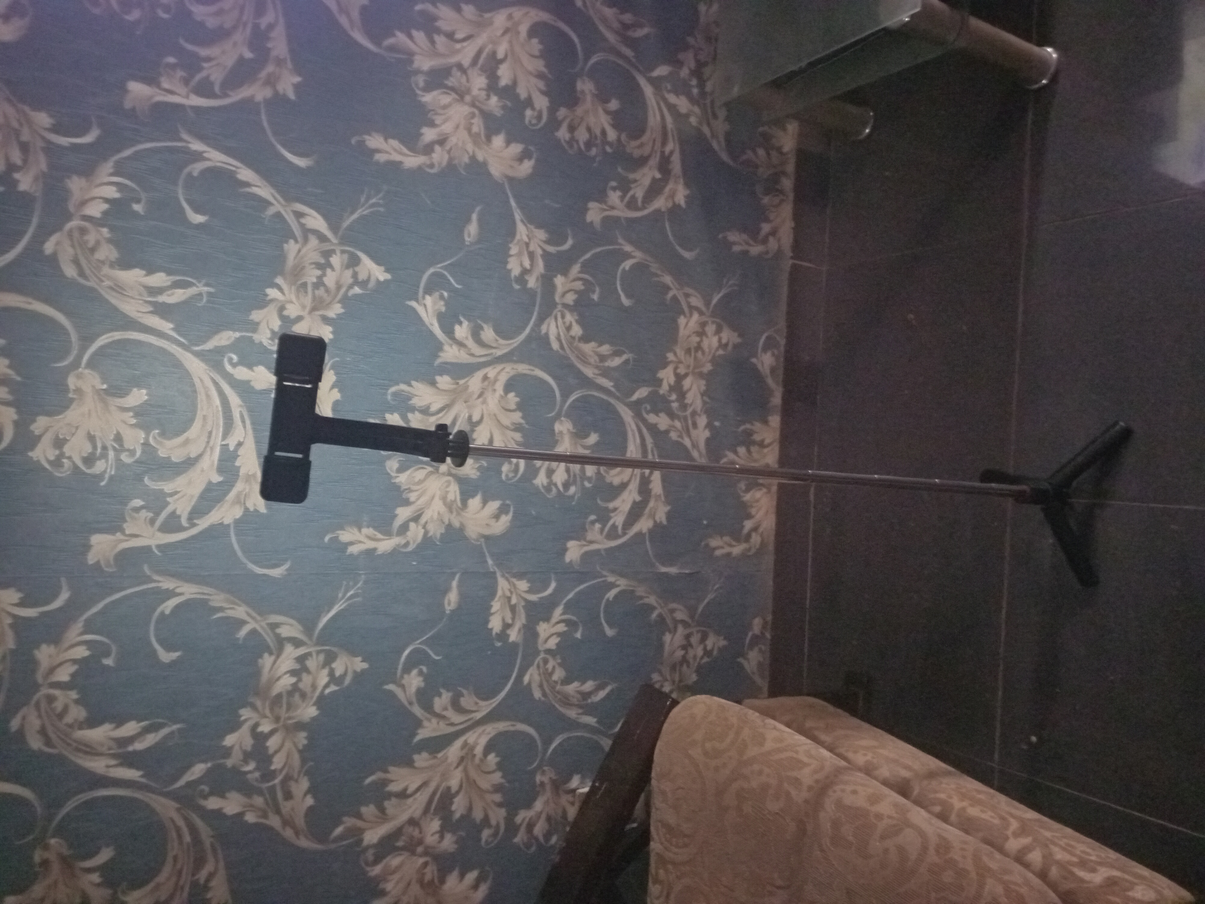 A basic phone holder and tripod can improve consistency because the camera stays at a fixed height and angle. Image: ChimaBee, Wikimedia Commons, CC BY-SA 4.0.
For a camera, use a tripod with a head that allows precise angle changes. Turn off image stabilization only if your camera or lens manual recommends doing so on a tripod; modern stabilization systems vary.
10. Avoid the Ultra-Wide Smartphone Lens for Normal Catalog Shots
Ultra-wide lenses exaggerate perspective when the camera is close. The front of the product appears larger and the back appears smaller. Rectangular objects can look stretched near the frame edges.
For most product photos, use the phone’s standard camera or a moderate telephoto option when image quality remains good. Move the phone farther away and crop slightly instead of pushing the lens extremely close.
Exception: An intentionally dramatic lifestyle photograph may use a wide perspective, but the main product image should prioritize accurate shape.
11. Keep the Camera Level When Shape Matters
If you tilt the camera down at a tall product, vertical lines converge. If you shoot a rectangular box from too low, the underside becomes exaggerated.
Use grid lines and level indicators if your phone or camera provides them. For a straight-on catalog view, keep the sensor plane approximately parallel to the face of the product.
Use perspective intentionally for three-quarter views, not accidentally.
12. Lock Focus and Exposure on a Smartphone
Automatic phone cameras can change brightness and focus between shots because the background or product color changes.
Tap the product to focus. If your camera app allows exposure/focus lock, lock it after establishing the correct exposure. Adjust exposure compensation rather than allowing every frame to float unpredictably.
A white product on a white background can fool automatic exposure differently from a black product on the same background. A locked or controlled exposure keeps a product series more consistent.
13. Shoot at the Lowest Practical ISO
Higher ISO makes the camera more sensitive in the sense that it amplifies the signal, but it generally reduces image quality by increasing noise and reducing usable dynamic range.
Because products are stationary, you can often use a slower shutter speed on a tripod and keep ISO low.
On a smartphone, the default camera may choose settings automatically. Give it abundant light and a stable mount so it does not need to raise ISO aggressively.
14. Choose Aperture for Depth of Field, Not Maximum Blur
Portrait photography often celebrates blurred backgrounds. Catalog product photography frequently needs the opposite: enough depth of field that the important parts of the product are sharp.
With interchangeable-lens cameras, middle apertures such as f/5.6, f/8, or f/11 are common starting points depending on sensor size, lens, product depth, and required output. Very small apertures can introduce diffraction, so “smaller is always sharper” is not true.
For tiny products such as jewelry, depth of field can be extremely shallow. You may need to align the product plane carefully or use focus stacking for specialized work.
15. Choose White Balance Before You Correct Color
Accurate color matters in ecommerce because color mismatch causes disappointed customers and returns.
If your camera supports custom white balance, use a neutral gray card or white-balance target under the same light as the product. If you shoot RAW, you retain more flexibility to correct white balance later.
If you use a smartphone, avoid mixing warm and cool lights and use editing software to neutralize obvious color casts.
Verification: Compare the product under neutral room light with the edited image on a calibrated or reasonably accurate display. The goal is not to make the product more saturated; it is to represent it faithfully.
16. Keep One Lighting Setup for an Entire Product Family
If you sell 20 candles, 40 phone cases, or 60 jewelry pieces, do not reinvent the light for each product unless there is a reason.
Create a lighting diagram:
- distance from table to background;
- camera height;
- camera distance;
- main light position;
- reflector position;
- background material;
- exposure settings;
- white-balance method.
Photograph the setup itself and save the photo in a “studio reference” folder. This turns visual consistency into a procedure rather than memory.
 A larger studio follows the same principles as a DIY setup: stable camera position, controlled soft light, and a repeatable background. Image: Hubertl, Wikimedia Commons, CC BY-SA 4.0.
17. Photograph the Main Hero Angle First
The primary image should answer “What am I buying?” immediately.
For a single object, a front or three-quarter angle often works. Avoid accessories, props, hands, and background objects in the main image unless the marketplace allows them and they are necessary to understand the product.
Frame the product large enough to be readable on a mobile thumbnail while leaving enough margin for marketplace cropping.
Google currently recommends that the product occupy roughly 75% to 90% of the image area for strong product-feed presentation. That is a useful starting point even outside Google, but always check the platform’s exact rules.
18. Add a Three-Quarter View to Show Depth
A straight front view can hide thickness. Rotate the product approximately 30 to 45 degrees so the front and one side are visible.
Use the same camera height and focal length as the main image when possible. This makes the set feel coherent.
For irregular items, rotate the product on the table rather than walking the camera around it. Fixed camera geometry makes it easier to maintain consistent scale.
19. Show the Back, Bottom, and Functional Areas Buyers Care About
A photograph of the back can answer questions about ports, mounting holes, care labels, ingredient lists, closures, pockets, switches, and manufacturing marks.
The bottom can matter for footwear, furniture feet, cookware bases, ceramics, electronics, and collectible condition.
If a side contains the product’s most important control or interface, photograph that side clearly rather than following an arbitrary eight-angle template.
20. Use Close-Ups to Prove Quality
Detail images are especially valuable for products where quality lives in small construction features.
Examples:
- stitching on leather;
- grain in wood;
- texture in fabric;
- engraving;
- machining marks;
- connector ports;
- brush bristles;
- surface finish;
- packaging seals;
- jewelry clasps.
Make sure the close-up is truly sharp. If the camera cannot focus at that distance, move back and crop or use a macro-capable lens.
21. Add a Scale Reference Without Confusing the Main Image
Dimensions in text are important, but shoppers still benefit from visual scale.
Use:
- a hand holding the product;
- the product on a desk, shelf, or body;
- a ruler or measurement graphic in a secondary image;
- the product beside a common object when appropriate and not misleading.
A scale image should be supplementary. Keep the main image clean.
22. Photograph Variants Separately When Color or Material Changes
If a blue shirt and red shirt are separate variants, use an image that accurately shows the selected variant. Google Merchant Center explicitly emphasizes matching the submitted image to the correct product color, pattern, and material.
Do not show multiple color variants in the main image for a listing that represents one specific variant unless the platform’s structure and rules support that presentation.
Maintain identical lighting and white balance across variants so the shopper can compare color differences fairly.
23. Photograph Bundles So the Buyer Sees Everything Included
If the product is sold as a bundle, photograph all included items together in at least one clear image. Google requires bundle images to show all products included when the item is identified as a bundle in product data.
Then add individual close-ups if needed.
Avoid decorative props that look like included accessories when they are not. If a prop could reasonably confuse a buyer, remove it or make the listing copy unmistakably clear.
24. Use Lifestyle Photography to Answer “How Does This Fit Into My Life?”
Lifestyle images are not replacements for clean catalog views. They answer a different question.
A coffee mug on a breakfast table communicates use. A backpack on a person communicates scale. A lamp in a room communicates style and size. A skincare bottle beside a sink communicates context.
Keep the product recognizable and avoid creating a scene so visually busy that the item becomes a prop in its own advertisement.
25. Shoot Reflective Metal With Large White and Black Cards
Polished metal often looks gray or black because it reflects the room.
Place white boards on either side to create broad bright bands. Add narrow black cards where you want edges and shape. Move the cards, not just the lights.
For cylindrical metal objects, long vertical cards create clean vertical reflections that describe the curve.
Troubleshooting: If the product looks flat white, add a controlled dark reflection. If it looks black and muddy, increase white surfaces around it.
26. Photograph Glass by Controlling Edges
Clear glass can disappear against a white background because there is little contrast.
Two common approaches are:
- Bright-field: bright background with dark edge cards to define the glass outline.
- Dark-field: dark background with bright edge reflections.
For ecommerce white-background images, bright-field is often easier to integrate. Place black cards just outside the camera frame on each side to create dark edge definition.
27. Photograph Black Products by Creating Reflections, Not Just Adding Exposure
A black product photographed as a dark silhouette may need shape-defining highlights.
Use large soft lights or white reflectors at angles that create gentle reflections on edges and curves. Increasing exposure alone can turn the background gray without revealing product form.
Preserve the product’s true black color while making its texture visible.
28. Photograph White Products Without Losing Their Edges
A white product on a white background needs subtle tonal separation.
Do not simply overexpose everything until the background clips. Use side lighting, edge contrast, and a small separation between product and backdrop. Preserve texture and form.
In editing, you can bring the background close to clean white while retaining detail in the product itself.
29. Photograph Jewelry With Clean Reflections and Controlled Focus
Jewelry combines tiny size, reflective metal, gemstones, and shallow depth of field.
Use a stable camera, macro-capable lens or phone macro mode if it is genuinely sharp, diffuse lighting, and careful product positioning.
Clean jewelry meticulously because dust and fingerprints become enormous in close-up images.
Avoid heavy clarity or sharpening that makes metal edges look unnatural. For color gemstones, use consistent white balance and avoid saturation changes that misrepresent hue.
30. Photograph Clothing Flat, Hanging, or On a Person Depending on What Matters
Flat-lay photographs show shape and construction cleanly. Hanging images reveal drape better. On-model images communicate fit and proportion.
An effective apparel listing often combines all three roles rather than forcing one method to do everything.
Show important details such as seams, pockets, cuffs, fabric texture, closures, lining, and labels where appropriate.
31. Photograph Food Products With Accuracy and Shelf Context
Packaged food photography should show the actual package clearly. If the food itself is part of the listing experience, add a secondary serving image.
Do not visually enlarge portion size, add ingredients that are not included, or hide legally important label information in ways that could mislead buyers.
For reflective packaging, use large diffusion panels and angle the package slightly until glare moves away from the label.
32. Create a Repeatable Camera-Angle Template
For each product family, define angle numbers:
- Front hero
- Three-quarter left
- Three-quarter right
- Back
- Side
- Detail
- Scale
- Lifestyle
You may not use all eight every time. The point is to make your process predictable.
Name files according to the angle, for example:
SKU1234-front.jpg
SKU1234-3q-left.jpg
SKU1234-back.jpg
SKU1234-detail-stitching.jpg
33. Shoot More Resolution Than the Platform Minimum
Minimum resolution is a pass/fail threshold, not an ideal capture target.
Large originals allow you to crop for different marketplaces, zoom features, and future design needs. Google recommends 1500 × 1500 pixels or above when possible, while Etsy recommends at least 2000 pixels for listing images.
Keep a high-resolution master and export smaller delivery versions for specific platforms.
34. Shoot RAW When It Improves Your Workflow, Not Because It Sounds Professional
RAW files preserve more editing latitude for exposure and white balance than finished JPEGs. They are useful when you use an interchangeable-lens camera or a phone app with reliable RAW capture and when you already have an editing workflow.
JPEG can be perfectly adequate for straightforward product photography when exposure and white balance are controlled in-camera.
Do not add a complicated RAW workflow if it slows production without improving the final images.
35. Keep Exposure Consistent Across a Product Set
If one product image is bright and the next is dark, the catalog feels inconsistent.
Use manual exposure on a camera when your lighting is fixed. On a smartphone, lock exposure when the app permits it.
For products with very different brightness, adjust carefully while preserving the same background appearance.
36. Use a Gray Card or Color Target for Color-Critical Products
If you sell paint, fabric, cosmetics, art materials, gemstones, or products where color accuracy is central, include a gray card or color target in one reference shot under the same lighting.
Use it to set white balance during editing, then remove it from the final product composition.
Remember that the buyer’s monitor or phone can still display color differently. Your goal is to create the most neutral, accurate source image you can.
37. Edit in a Consistent Order
A practical edit sequence is:
- crop and straighten;
- correct perspective if necessary;
- set white balance;
- adjust exposure;
- control highlights and shadows;
- correct background tone;
- remove temporary dust or sensor spots;
- apply moderate sharpening;
- export in the correct color space and size.
Do not reshape the product, erase genuine flaws in used goods, change color to something more attractive, or remove construction details the buyer will receive.
38. Retouch Dust, Not Reality
There is a useful ethical line between cleaning the photograph and changing the product.
Reasonable cleanup can include:
- sensor dust;
- a stray temporary hair;
- background scuffs that are not part of the item;
- temporary support hardware meant to be invisible.
Misleading edits include:
- removing a permanent scratch from a used item;
- straightening a genuinely bent product;
- changing material texture;
- making a gem more saturated;
- removing seams or manufacturing marks;
- making included quantity look larger.
When in doubt, ask: Will the buyer receive what this image promises?
39. Export in sRGB for Most Web Marketplaces
sRGB remains the safest general-purpose color space for web delivery because browsers, phones, and marketplaces are widely designed around it. Etsy explicitly notes that uploaded images are converted to the sRGB color profile.
Keep master files in your editing workflow as needed, but export marketplace-ready versions in sRGB unless a platform specifies something else.
40. Choose JPEG, PNG, WebP, or TIFF for the Right Stage
For final ecommerce photography, JPEG is widely supported and efficient for photographs. PNG can be useful for transparency or graphics where the platform supports it. WebP provides efficient web compression on many platforms. TIFF is more appropriate as a high-quality working or archival format than as a default storefront format.
Google Merchant Center currently accepts JPEG, WebP, PNG, GIF, BMP, and TIFF for product image links, subject to its other image rules.
Check the sales channel before exporting because accepted formats vary.
41. Compress Without Destroying Product Detail
Large files slow page loading, while aggressive compression creates artifacts around product edges and fine textures.
Export a web version at the dimensions your site actually needs, use a reasonable quality setting, and inspect it at 100% zoom.
Watch for:
- blocky gradients;
- smearing in fabric texture;
- halos around edges;
- banding in backgrounds;
- soft text on packaging.
Keep the high-resolution master separately so you can re-export later.
42. Name Files for Humans and Systems
Do not upload IMG_8473.JPG when you can upload a descriptive filename.
Use:
sku-product-name-color-front.jpg
This helps internal organization, reduces accidental mismatch between variants, and makes bulk workflows easier.
Avoid extremely long filenames, unusual symbols, and inconsistent punctuation.
43. Write Alt Text That Describes the Product Image
Alt text should help someone who cannot see the image understand its essential content.
Bad:
“Best amazing luxury handmade leather wallet buy online.”
Better:
“Brown bifold leather wallet shown open with six card slots and a bill compartment.”
Use natural description, not keyword stuffing.
44. Build a Folder Structure for Product Photography
A simple structure:
Product Photography / SKU / RAW / Masters / Web / Marketplace
Within Marketplace, you can create platform folders if crops or sizes differ.
Keep a spreadsheet or product-information system that maps SKU to product title, variant, and final image filenames.
45. Back Up Originals Before You Reuse a Memory Card
After the shoot:
- copy files to your working computer;
- confirm that the files open;
- create a second backup;
- only then reuse or format the memory card.
For smartphone photography, confirm that photos have synced or backed up according to your system before deleting them from the device.
46. Use a Contact Sheet to Choose Images Faster
A contact sheet displays many thumbnails together. It helps you compare expression, angle, reflection, focus, and product position without opening every file individually.
Select:
- best hero image;
- best three-quarter;
- sharpest detail;
- best scale image;
- best lifestyle image.
Do not select ten nearly identical photographs when five distinct images answer more buyer questions.
47. Inspect Focus at Full Size Before Uploading
A photograph can look sharp as a phone thumbnail and still be soft on a product page.
Zoom to 100% and inspect the most important feature: logo, label, texture, control panel, stitch line, or product edge.
Check especially for:
- camera shake;
- focus on the background rather than product;
- excessive noise reduction;
- motion blur from a moving model;
- shallow depth of field that hides important areas.
48. Check Color on More Than One Screen
You do not need a professional grading suite to catch gross color problems.
Compare the final image on:
- your editing monitor;
- a phone;
- another reasonably modern display if available.
If the product looks radically different across devices, investigate whether your editing monitor is unusually warm, cool, bright, or saturated.
49. Preview the Thumbnail, Not Just the Full Image
Many shoppers first see your image at a very small size.
Reduce the image until it resembles a search-results thumbnail. Ask:
- Can I identify the product immediately?
- Does the item fill enough of the frame?
- Does the background distract?
- Is the important shape clear?
- Will marketplace cropping cut off the product?
Etsy specifically recommends leaving enough border and keeping the main subject centered enough to survive multiple crop shapes.
50. Do Not Put Text Everywhere Unless the Platform and Image Role Support It
Feature callouts, dimensions, and comparison graphics can be useful in secondary images on your own store or on marketplaces that permit them. But the first image often performs best as a clear product view, and some product-feed systems restrict overlays.
Keep a clean source image before creating any graphic version.
51. Photograph Measurements Instead of Asking the Buyer to Imagine Them
For products where fit matters, create one secondary image with dimensions.
You can photograph the product beside a ruler, then create a clean graphic that labels width, height, and depth. Do not distort the product to make arrows fit.
For clothing, combine garment measurements with on-body fit photographs and clear sizing information.
52. Keep Props From Becoming Accidental False Advertising
If you photograph a laptop stand with a laptop, a coffee dripper with a mug, or a necklace with a jewelry box, the customer may wonder whether those items are included.
Use props for lifestyle context, but keep one clean image showing exactly what the buyer receives. In the listing copy, state inclusions clearly.
53. Make a “No Surprises” Condition Set for Used Products
For second-hand, refurbished, vintage, or collectible items, product photography should reduce surprises rather than hide condition.
Photograph:
- front;
- back;
- sides;
- serial or model information where appropriate;
- wear;
- scratches;
- dents;
- repairs;
- included accessories;
- working screen or controls if relevant.
A transparent condition set can increase trust even if it makes the item look less “perfect.”
54. Use a Shot List for Batch Photography
Batch work saves time when you photograph similar products.
Example:
| Shot | Required? | Notes |
|---|---|---|
| Front hero | Yes | White background, centered |
| 3/4 view | Yes | Rotate product 35° |
| Back | Yes | Show label/ports |
| Detail | Yes | Texture or craftsmanship |
| Scale | Optional | Hand or ruler |
| Lifestyle | Optional | Context scene |
Finish shot 1 for every product, then shot 2 for every product if rotating the product is faster than rebuilding the lighting each time.
55. Keep a Product-Photography Style Guide
Once you have a look you like, document it.
Your style guide can include:
- background color;
- shadow style;
- camera height;
- hero angle;
- crop ratio;
- product fill percentage;
- lighting diagram;
- white-balance method;
- export dimensions;
- JPEG quality;
- filename format;
- alt-text style.
A small business with a style guide can create a catalog that looks coherent even when photographs are taken months apart.
56. Worked Example: Handmade Ceramic Mug With a Smartphone
Goal: Create a clean marketplace-ready listing without studio lights.
Setup: Place a table beside a large north-facing or softly lit window. Tape white poster board to the wall and curve it onto the table. Place the mug approximately 40 centimeters from the vertical background. Put a white foam board opposite the window.
Camera: Mount the phone on a tripod using the standard lens. Move the phone back far enough that the mug does not look distorted. Turn on grid lines and keep the phone level.
Shots:
- front hero;
- three-quarter view showing handle depth;
- top view showing interior glaze;
- bottom maker’s mark;
- close-up of glaze texture;
- hand-held scale image;
- lifestyle image with coffee on a simple table.
Editing: Correct white balance so the ceramic color matches reality, lift background brightness carefully, remove only temporary dust, and export a large sRGB JPEG.
Success check: Compare the mug beside the phone display. The glaze hue should look believable, the handle should not appear stretched, and the thumbnail should immediately read as “one ceramic mug.”
57. Worked Example: Black Bluetooth Speaker on White Background
Problem: The black speaker looks like a featureless silhouette.
Solution: Use a large soft light from the left and a white reflector on the right. Add a narrow white card behind and slightly to one side so a controlled edge reflection outlines the speaker.
Lower exposure enough to preserve the black finish but not so far that texture disappears. Photograph the grille close-up separately.
What not to do: Raise shadows aggressively in editing until the black plastic becomes gray. Build shape with light instead.
58. Worked Example: Reflective Stainless-Steel Bottle
Problem: The bottle reflects the photographer, window, and room.
Setup: Surround the bottle with large white boards or diffusion panels, leaving a narrow opening for the camera. Position black strips strategically to create edge contrast.
Rotate the bottle so the label is square to the camera. Move cards while watching live view until reflections become clean vertical bands.
Success check: The viewer should see the product’s cylinder shape without seeing a recognizable room reflected across it.
59. Worked Example: Clothing Listing With Color Variants
Goal: Show four shirt colors consistently.
Use the same model, background, camera position, light, white balance, and pose sequence for all variants. Photograph a clean front, back, side, fabric detail, collar, and on-body three-quarter view.
Do not edit the blue shirt by changing the hue of the red-shirt photograph. Photograph the real blue variant. This produces more believable fabric texture and accurately represents the physical item.
60. Troubleshooting: The White Background Looks Gray
Possible causes:
- background receives less light than the product;
- auto exposure darkens the scene because it sees a lot of white;
- the background is physically gray or dirty;
- room lighting introduces a color cast.
Solutions:
- increase background illumination;
- use exposure compensation or manual exposure;
- clean or replace the background;
- edit background tone carefully while preserving product edges.
61. Troubleshooting: Product Colors Change Between Photos
Likely causes include auto white balance, mixed lighting, different editing presets, or changing daylight.
Use one light type, lock white balance when possible, include a reference card, and shoot a product family in one session before the window light changes dramatically.
62. Troubleshooting: Smartphone Photos Look Soft
Check:
- dirty camera lens;
- digital zoom;
- low room light causing high ISO and noise reduction;
- camera shake;
- focus on background;
- very close distance beyond the lens’s focus capability;
- portrait mode creating artificial blur around product edges.
Clean the lens, add more light, stabilize the phone, use the standard camera, and move back slightly.
63. Troubleshooting: Jewelry Is Sharp in Front but Blurry in Back
Depth of field is too shallow.
Move the camera slightly farther away, use a smaller aperture on an interchangeable-lens camera, align the product so important areas are closer to the same focus plane, or use focus stacking for advanced work.
64. Troubleshooting: Shadows Look Too Hard
Make the light source larger relative to the product by moving diffusion closer, using a larger softbox, or shooting beside a larger window. Move the product farther from the background if the rear shadow is distracting.
65. Troubleshooting: Everything Looks Flat
You may have too much even front light.
Move the main light to one side, reduce fill, and allow a gentle shadow gradient to reveal shape. Product photography does not require eliminating every shadow; it requires controlling shadows.
66. Troubleshooting: The Product Looks Distorted
Move the camera farther away and use a normal or mild telephoto focal length. Keep the camera level. Avoid placing the product near the extreme edges of an ultra-wide smartphone frame.
67. Troubleshooting: Marketplace Crops Off the Product
Leave more margin in the source image. Preview square, horizontal, and vertical crops. Keep the most important content near the center.
This is particularly important on Etsy, where the first image can appear in different thumbnail shapes.
68. A 90-Minute DIY Product-Photography Workflow
Minutes 0–10: Clean products, prepare shot list, gather props only if needed.
Minutes 10–20: Build background, place tripod, set window or lights, establish reflector.
Minutes 20–30: Photograph one test product. Check exposure, color, reflections, focus, and thumbnail framing.
Minutes 30–60: Photograph hero, three-quarter, back, detail, and scale shots for the batch.
Minutes 60–70: Back up files and create contact sheet.
Minutes 70–85: Edit selected images using one consistent sequence.
Minutes 85–90: Export, inspect at 100%, preview thumbnails, and verify filenames.
69. A Minimum Equipment List for a Small Seller
- smartphone or camera with clean lens;
- tripod or stable phone stand;
- white or neutral seamless background;
- large window or one to two diffused lights;
- white foam board reflector;
- black foam board for reflective products;
- microfiber cloth and product-cleaning tools;
- removable tape and clamps;
- gray card if color accuracy matters;
- editing app or desktop software;
- backup storage.
You do not need to buy all of this on day one. Start with a phone, stable support, window, white background, and reflector. Upgrade the part that limits your results.
70. When to Hire a Professional Product Photographer
DIY photography makes sense when:
- products change frequently;
- the catalog is simple;
- budget is limited;
- you can create consistent acceptable images;
- speed matters more than complex styling.
Professional help becomes more valuable when:
- products are highly reflective;
- color accuracy is critical;
- you need complex composites or focus stacking;
- the launch campaign has high commercial value;
- you need a large catalog shot to strict specifications;
- you need on-model styling, food styling, or specialist retouching;
- your own photography is clearly lowering the perceived quality of the product.
71. Final Quality-Control Checklist
- The actual product is clean and accurately represented.
- The correct variant is shown.
- The main image makes the product immediately identifiable.
- The background follows platform rules.
- The product survives thumbnail cropping.
- Focus is sharp on important details.
- Color is believable and consistent.
- Reflections are controlled.
- White products retain detail.
- Black products retain texture.
- Scale is shown somewhere in the image set.
- Back, side, or functional areas are included where useful.
- Bundles clearly show included items.
- Props cannot easily be mistaken for included items.
- Used-item flaws are not hidden.
- Image dimensions meet the marketplace’s current requirement.
- Files are exported in a web-compatible color space.
- Compression has not destroyed fine detail.
- Files use clear names.
- Alt text describes the image naturally.
- High-resolution masters are backed up.
Frequently Asked Questions
Can a smartphone take professional-looking product photos?
Yes. For many small and medium products, a modern smartphone can produce excellent ecommerce images when light, camera stability, background, product preparation, and editing are controlled. Lighting and consistency often matter more than buying an expensive camera immediately.
What is the best background for product photography?
A seamless white or neutral background is a strong default for main ecommerce images because it reduces distraction and works with many marketplace layouts. Secondary lifestyle images can use environmental backgrounds. Always check the rules of the platform where the image will be used.
Do I need two lights?
No. One large soft source and a reflector can produce strong results. A second light becomes useful when you need independent control over the background, fill, edge highlights, or difficult reflective surfaces.
Should I use a ring light for products?
A ring light can work for small frontal subjects, but its reflection can be distracting on glossy products and its front-lighting pattern can flatten shape. Large side softboxes or window light often give more control for catalog photography.
What image size should I upload?
Use the platform’s current requirements. Google Merchant Center has announced a 500 × 500 pixel minimum for all product images beginning January 31, 2027 and recommends around 1500 × 1500 pixels or more when possible. Etsy currently recommends listing images at least 2000 pixels in width and height. Your own ecommerce site may have different ideal dimensions.
Should the product fill the whole frame?
It should be large enough to read clearly without being cropped. Google recommends roughly 75% to 90% product coverage in the image area for product listings. Other platforms may crop differently, so leave enough safe margin for thumbnails.
Is a white background always required?
No. White is a strong default and is recommended in many product-feed contexts, but lifestyle and staged images are useful secondary images. Some categories or platforms support transparent backgrounds, while others convert transparency unexpectedly. Check platform rules.
Should I shoot vertical or horizontal?
Choose based on the platform and product shape. Etsy currently recommends a horizontal or square first listing photo and advises leaving enough margin for multiple thumbnail crops. For your own site, use the aspect ratio designed into your product grid.
Is RAW better than JPEG?
RAW gives more editing flexibility, especially for exposure and white balance. JPEG is faster and can be completely sufficient when lighting and exposure are controlled. Use the format that improves your real workflow rather than automatically choosing the more complex option.
How do I make product photos look consistent over several months?
Document your setup. Keep a lighting diagram, tripod position, camera height, background, exposure settings, crop rules, angle sequence, export settings, and a reference photo of the studio. Repeat the same system for new products.
Conclusion: Build a Repeatable Studio, Not a Collection of Lucky Photos
Product photography becomes much easier when you stop treating every item as a new creative problem.
Control the environment first. Clean the product, create a seamless background, choose one soft lighting method, stabilize the camera, use a normal perspective, and document the setup. Then photograph a purposeful sequence: hero, depth, back or side, detail, scale, and use. Edit for truth and consistency rather than drama. Export large enough files for current marketplace requirements, preserve sRGB color for web delivery, and keep high-resolution masters backed up.
The most important mistake to avoid is trying to rescue a weak setup in editing. A badly reflected bottle, distorted wide-angle box, blurred label, or mixed-color light takes far longer to fix than it takes to adjust the scene before pressing the shutter.
Your first practical step is simple: choose one product, place it beside a large window on a clean seamless background, mount your phone on something stable, add a white reflector opposite the window, and photograph the same five angles. Review those images at full size and as tiny thumbnails. Once that set works, write down the setup and turn it into your production standard.
Sources and Further Reading
- Google Merchant Center Help — Image link and product image guidelines
- Google Merchant Center Help — Image too small and upcoming 500 × 500 requirements
- Etsy Help — Requirements and Best Practices for Images in Your Etsy Shop
- Etsy — Listing Image Requirements
- Wikimedia Commons — How to Take Pictures
Image Credits
- “Professionelle Produktfotografie im Fotostudio.jpg” — Klaus Ohlenschläger, Wikimedia Commons, CC BY-SA 4.0.
- “Mini tripod and phone holder.jpg” — ChimaBee, Wikimedia Commons, CC BY-SA 4.0.
- “Studioarrangement for product photography and video 2296.jpg” — Hubertl, Wikimedia Commons, CC BY-SA 4.0.